I had every intention of taking a part of what I liked about sketch 2/365 and exploring it more in depth yesterday. Instead, it turned into its own thing – the colors and stamp choices being used on the fly. I am keeping track of what I’m using to create these quick mixed media collages, but not the order of operations.

To get the most out of my sketchbook, each page is being used on both sides. I had a moment yesterday where I asked myself whether I should do one page per sketch just in case I ever wanted to display one or more. What if I like both the front and the back? I had to remind myself that these are quick studies and are not precious.

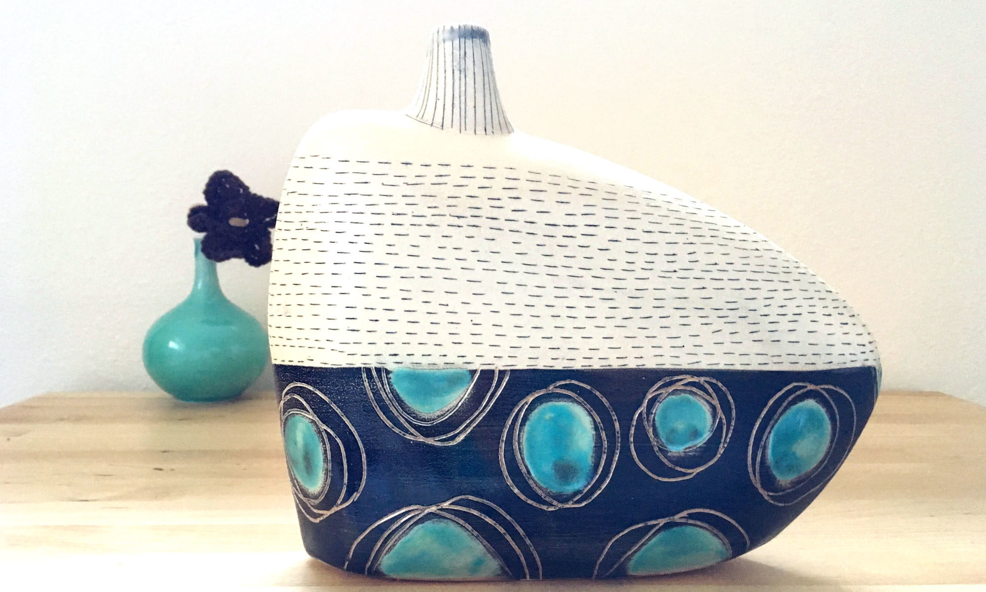
I have already begun the process of testing out some of these stamped/painted designs on clay with mixed results when fired to cone 10 in reduction. The mishima decorated ones turned out great, but the stamped ones are muddy. While I normally fire to ^6, I had the opportunity to fire some work at the Colorado Potters Guild at ^10 reduction. Why not? It’s a good way to test out how the designs hold up at different temperatures.
A few weeks ago, I listened to Tales of the Red Clay Rambler, episode 94 and Charlie Cummings briefly described the benefits of working at cone 1 to Ben Carter. I perked up. At cone 1 the clay is more vitrified and less fragile than traditional earthenware, yet the colors are brighter and the clay warps less than at higher temps. Later when I returned home from my studio, I googled cone 1 glazes and there’s just not a ton of info out there. I did find a post dated from 2006 on potters.org where Charlie shared some of his base clay and glaze recipes. I think it’s a good starting point to do some testing.

Ingredients:
- Sketchbook with heavy stock paper for water media
- Printed newspaper torn (I selected an article that talked about the redevelopment of an area close to my house)
- Liquitex satin varnish
- Paint brush
- Water
- Black pen – Pilot 0.5 V-Ball (one of my favorites)
- Ink pads (not waterproof) (turquoise, black, sepia and white)
- Hand carved rubber stamps
- Toilet paper roll
~C

interesting about cone 1 being more vitrified I have been making clay bells and am half thinking of making them unglazed so a more vitrified clay would be good for that use I think. toilet paper rolls come in handy for lots of things, you mentioned cone 10, have you tried Windsor Porcelain by laguna, it’s a dream to work with at hand building.
I have never tried Windsor Porcelain Linda – I think one of my clay suppliers carries Laguna, I’ll have to look for it. I don’t fire cone 10 often…mostly just group firings at the Colorado Potters Guild. Another impetus for firing lower is that it uses less energy and it’s less expensive.