Sketches 16-33/365

Follow my blog with Bloglovin

Sketch to Pot
Sketch to Pot

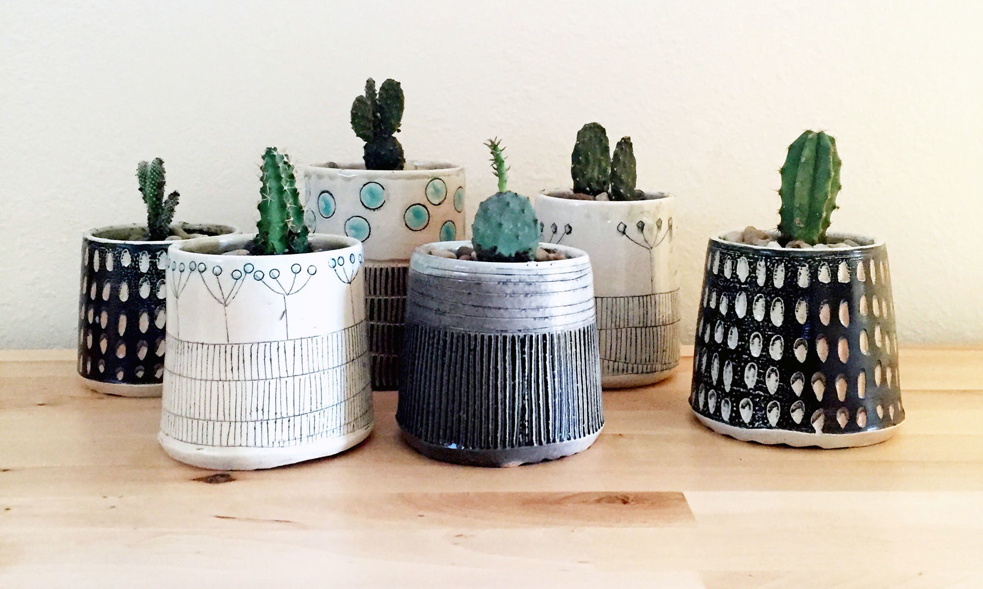
I’ve let the last two weeks worth of sketches accumulate without documenting them here on my new blog…but I have been working hard to translate some of the imagery to my pots. I blame my deadline for my fast approaching group sale for the lax posting. The pots in the photo above are currently cooling in the soda kiln at the Colorado Potters Guild as I write this. My compadres and I will be unloading them on Monday, April 27th at 2pm – just in time to inventory them for our Spring Sale happening April 30 – May 2!

Sketch 11/365 4-3-15
Sketch 11/365 4-3-15 definitely influenced my pots

An interesting thing happened when I was working my sketchbook imagery to my clay work – the mark making has to be simplified when adding it to a pot. Conversely, I started getting a ton of ideas that I wanted to explore in 2D once I started adding surface interest to the pots. My sketches have become increasingly more colorful, playful and detailed.

Sketches 31 + 32
Sketches 31 + 32

I’m having so much fun with these and am considering recreating some of these as prints. The one thing I keep asking myself is why haven’t I keep a sketchbook before? I’m past the 30 days of sketching and often have ideas lined up for future drawings. It does take some discipline to make time to draw everyday, but it feels like such a great investment.

Since I haven’t kept up with my posting, here’s a quick 15 second Flipogram to highlight the first 30 days. I am going to make a concerted effort to post at least 3 times a week going forward.

Sketches 10/365 – 15/365

Sketch 11/365 4-3-15

From 2006 to 2009, I was a regular blogger – I kept a schedule. As a returning blogger, I find that I have to relearn the rhythm of keeping a regular practice of sharing images of what I am working on and to write a little context. Today, I am sharing 6 fairly quick sketches (most took about 20 minutes or less, with the exception of 13/365 which took about an hour) of last week’s efforts.

Some of these sketches come more easily to me than others, but I am super excited how each of these is going to make quite a library that I will be able to draw on for years. 365 days of sketching is a big commitment, yet so far, it is easy to squeeze in 15 to 20 minutes here and there. Sometimes, when I am making a drawing, ideas pop into my head for the next couple of day’s sketches. Some days, I stare at the blank page and am not sure how to start.

Not knowing how to start and relying on past work has always stunted my clay decorating efforts. It’s much easier to go back to what I know than to expand on what I’ve done in the past or to invent something new. I hope that through this year long exercise that I will be able to make some serious creative break throughs.

This past week, I’ve really enjoyed working with sumi ink and pen – so I’ve decided to continue in the same vein this week with the addition of a single color.

Below are last week’s sketches along with the “ingredients” list. I was careless a few days and didn’t photograph all of the ingredients.

[Best_Wordpress_Gallery id=”1″ gal_title=”April 8″]

Sketches 5/365 – 8/365

sketch 7/365 3-30-15
sketch 8/365 3-31-15

Sketches 7 + 8 came pretty easy to me and are the inverse of each other. I decided to give myself some self imposed weekly parameters to help guide my sketching efforts. This week is ink and pen.

Keep in mind, I’m trying to use these as potential surface design treatments for my clay work. Some of my first week’s sketches could translate to clay, but after drawing 7 & 8, I know that these can definitely be used on a clay surface. In my mind, the ink is an underglaze or slip, the black lines are Mishima, and the white sgraffito. I’m will be heading to the Colorado Potters Guild this afternoon and am going to start the process of decorating some slab/coil built pieces that will be soda fired April 24.

Meanwhile, here are the other sketches I neglected to add, along with the “ingredients list” for each should I ever want to attempt to recreate one of these:


Sketch 4/365 Sometimes Less is More


Sketch 4/365 March 27 cropped

My last two sketches were rather dark, so I decided to lighten it up a bit after I found some green tissue paper (left over from gift wrapping) in my daughter’s room. Instead of recycling it, I decided to repurpose it in this sketch. I’ll be honest, it’s not my favorite…but then again, these daily sketches aren’t suppose to be works of art per se. They are meant to be informative – what happens when I layer this texture over this color, and then I add this stamped design on top of these two layers? You get the picture.


Sketch 4/365 March 27, 2015

4/365 started to look like colorful fabric, and I decided to add a final layer of sketched flowers that I had previously turned into laser toner decals (see below). Adding a layer of line art on top of my collage corresponds nicely with the use of ceramic decals. Sometimes less is more – learning when to edit is important which is why I think I am really going to find this daily “sketch” practice really valuable in the long run. I should be able to reference this sketch book for years when I need a bit of inspiration.

Mug with laser toner floral decals


Ingredients for 4/365

Ingredients:

  1. Sketchbook with heavy stock paper for water media
  2. Torn green tissue paper
  3. Liquitex satin varnish
  4. Paint brush
  5. Water
  6. Laser copy of flowers I had drawn for decals
  7. Ink pads (not waterproof) (turquoise, black, sepia and white)
  8. Hand carved rubber stamps
  9. Eco House Orange Terpene for image transfer of laser copy
  10. Pencil
  11. Golden Raw Umber Acrylic Satin Glaze
  12. Scissors

~C


Sketch 3/365 + Lowering Clay Temperature

3/365 March 26, 2015 cropped

I had every intention of taking a part of what I liked about sketch 2/365 and exploring it more in depth yesterday. Instead, it turned into its own thing – the colors and stamp choices being used on the fly. I am keeping track of what I’m using to create these quick mixed media collages, but not the order of operations.

3/365 - 15 min.
3/365 – 15 min.

To get the most out of my sketchbook, each page is being used on both sides. I had a moment yesterday where I asked myself whether I should do one page per sketch just in case I ever wanted to display one or more. What if I like both the front and the back? I had to remind myself that these are quick studies and are not precious.

Bisque fired pots
Bisque fired pots

I have already begun the process of testing out some of these stamped/painted designs on clay with mixed results when fired to cone 10 in reduction. The mishima decorated ones turned out great, but the stamped ones are muddy. While I normally fire to ^6, I had the opportunity to fire some work at the Colorado Potters Guild at ^10 reduction. Why not? It’s a good way to test out how the designs hold up at different temperatures.

A few weeks ago, I listened to Tales of the Red Clay Rambler, episode 94 and Charlie Cummings briefly described the benefits of working at cone 1 to Ben Carter. I perked up. At cone 1 the clay is more vitrified and less fragile than traditional earthenware, yet the colors are brighter and the clay warps less than at higher temps. Later when I returned home from my studio, I googled cone 1 glazes and there’s just not a ton of info out there. I did find a post dated from 2006 on potters.org where Charlie shared some of his base clay and glaze recipes. I think it’s a good starting point to do some testing.

3/365 sketch ingredients

Ingredients:

  1. Sketchbook with heavy stock paper for water media
  2. Printed newspaper torn (I selected an article that talked about the redevelopment of an area close to my house)
  3. Liquitex satin varnish
  4. Paint brush
  5. Water
  6. Black pen – Pilot  0.5 V-Ball (one of my favorites)
  7. Ink pads (not waterproof) (turquoise, black, sepia and white)
  8. Hand carved rubber stamps
  9. Toilet paper roll

~C


Sketch 2/365

Close up of 2/365
Close up of 2/365

In keeping with my intention of working intuitively and fast, sketch 2/365 turned into an abstracted landscape. I like what’s happening in parts of the piece, but not all.

2/365 - whole page
2/365 – whole page

I spent about 20 min. total on this not including the time for drying after I collaged a tea bag and some newspaper onto the page – I started making dinner while the page was drying. After I was done, I was reminded of graduate school studying landscape architecture. We called these quick drawings “ideograms” which are basically quick sketches meant to convey a concept or idea graphically. We used them in the early design phases to flesh out how something might be organized and to visualize a project. This was one of my favorite exercises. We also employed model making when building concepts.

When I called it done, I wondered if a more narrative piece like this would work on clay? Maybe tiles, but I don’t know if something in the round would work.

2/365 ingredients list

Ingredients:

  1. Sketchbook with heavy stock paper for water media
  2. Dried tea bag emptied of its contents
  3. Printed newspaper torn (I selected an article that talked about the redevelopment of an area close to my house)
  4. Liquitex satin varnish
  5. Paint brush
  6. Water
  7. Scissors
  8. Brush pen
  9. Black pen – Pilot  0.5 V-Ball (one of my favorites)
  10. Ink pads (not waterproof) (turquoise, black, sepia and white)
  11. Hand carved rubber stamp
  12. Sketch and wash pencil

~C

P.S. I mis-dated this piece. It should read 3-25-15 not 3-26-15.


Sketch 1/365

sketch 1/365 - mixed media
sketch 1/365 – mixed media

Yesterday, I had an amazingly productive day in my clay studio. When I returned home, I still had enough energy to start a sketch-a-day challenge that I had been threatening to do since New Years. I use the term sketch-a-day loosely – meaning that it might involve traditional sketching but more more likely my efforts will include collage, stamping, painting, and mark making.

These exercises are intended to be quick (less than 15 min) and intuitive with very little thought given to content. I don’t want this challenge to be a huge burden for me…one more thing to add to the “to-do” list. I want this daily practice to offer up another way to add surface interest and to inform my clay work. Even though these quick sketches are way less precious than pots, I still found myself hesitating since this was my first official entry in my brand spanking new sketchbook. I have to get over this….

hand built clay pots decorated with slip inlay and stamps

The clay work above represents some of my first attempts at drawing and stamping on clay. While I really like the way that these look as greenware (unfired for the non-clay readers), not all of them passed muster after glaze firing (I’ll share some photos another day). Another aspect of stamping/drawing on clay is that some of the more successful 2D sketches don’t translate well to a 3d surface. This was a real surprise to me.

sketch materials
sketch materials

What did I use?

  1. A used teabag (dried and emptied of its contents)
  2. Liquitex stain varnish to collage the tea bag to the paper
  3. Hand carved rubber stamps
  4. Ink pads (not waterproof)
  5. Paint brush
  6. Black pen – Pilot  0.5 V-Ball (one of my favorites)
  7. And, of course, a sketch book with heavier stock paper intended for water media.
surprise!
surprise!


I learned something else – the triangular shaped PG Tips tea bags are actually one long piece when you cut the seams – who knew?

~C

p.s. My mom told me that she found the font I’m using to be difficult to read – I want to be user friendly and will be switching it to a sans-serif one shortly.


RSS
Follow by Email
Facebook518
Pinterest1k
Pinterest
fb-share-icon
Instagram13k